Wednesday, December 26, 2012

I hope you had a . . .

Merry Christmas!


I bought a few last minute Christmas gifts for family and needed some wrapping.  I did not want to go to the store on Christmas Eve!  So I rummaged through my leftover wrapping supplies and found some old Starbucks bags.  I covered the bag with printed paper, then I put my Cricut to work!  I cut the present from the Seasons of Joy cartridge using more printed paper and some maroon cardstock for the bow.  That was pasted on the bag, then I cut a tag with the present cut-out.  I added some glitter paper and more printed paper to the back of the tag, so it shows through the cut-out, then backed the entire tag with white card.  I added a stamped greeting and a fuschia ribbon and attached the tag to the package with foam tape.  I cut the recipient's name from kraft card and added a shadow of maroon with the Plantin Schoolbook cartridge.  I made 5 of these in about two hours!  Everything was from my stash and it was a great use for all those bags I had been stockpiling.  Plus, my family loved the bags!  My sister Linda was delighted that I didn't put her name on her bag (made some gluing errors) because she wants to re-gift it! My sister Melanie was delighted because I used some paper she had given me!  I wish I had got a picture of all five together with the variety of colors and papers I used.  Here's a helpful hint:  When you are cutting a number of names or words with your Cricut at one time, cut the longest name or word twice.  That way you have a "bone pile" of extra letters in case you might inadvertently make a "glueing error"!

And here's one of my latest deer pictures:


I took this one Christmas Eve.  They are hoping you had a Merry Christmas too!

Thursday, December 13, 2012

Wishing you . . .

Peppermints and Candycanes!


I always liked this woodcut Santa stamp from Hero Arts.  I think he looks best in red and white, and I jazzed him up with Diamond Stickles and Pearl Pen.  A little bit of candy cane paper and some more red and white accents and he is a perfect "candy cane" Christmas greeting.  I can taste the peppermint!

And here's one of my latest deer pictures:


Saturday, December 1, 2012

Look what's hiding in the forest!


One humid foggy morning last week on my morning walk I was enchanted to find all these small "ground webs" on the forest floor.  I assume they are spider webs, but they are different from so many I have seen.  They are just an inch or half inch off the ground, many have a "hole" in them, and they disappear during the day!  I think they are really there, but we just can't see them.  The sunlight playing off the fog really highlighted them--some were even on the path!  There were literally 50 or 60 of them along the path I traveled, each one only about three inches in diameter.  I had never seen these before, so it must have been a good year for these spiders, or the atmosphere conditions were just right to allow them to show up.  The amazing appearance of these small webs one foggy morning was indeed magical.  Finding these webs truly made more concrete for me the idea that the world we ordinarily inhabit  is truly a "world within worlds" and there is so much more that we cannot see much less understand.  A humbling experience!

Saturday, November 24, 2012

Peace


This card features a white embossed Stampendous dove image.  I heat embossed on watercolor paper and then added some watercolor wash with Twinkling H2o's.  Really does sparkle!  (Click on the image for a better view.)   Almost, but not quite, as much as the sparkly American Crafts ribbon at the bottom of the card.  I set my image against a backdrop of an embossed Sizzix snowflake die accented with Crystal Stickles.  I wish you a sparkly holiday season.  Now that Thanksgiving is officially over, we can truly celebrate the Christmas season.  I don't know about you, but the term "Black Friday" is hardly joy inspiring.  Glad it's gone.

Monday, November 19, 2012

Thoughtful moment


I start my day looking for deer!  I take walks in the wooded park near my home most mornings, and I love looking at the little woodland creatures.  The deer here are not surprised to see me at all!  I especially like looking at the ones peeking out at me from the tall grass.  Every once in a while a deer will get "lost".  One morning I found one walking down my street in my neighborhood!  I hope he found his way home.  I think he went over the wrong fence!  Having the deer this close reminds me that no matter how much we try to pave over the world, nature will out.  I think we should help nature along a bit!  I am thankful for the parkland.

Friday, November 9, 2012

My first magazine article is now published!


I just got my advance copies of the January issue of Scrap and Stamp Arts.  Look on page 38!  My first published article appears there:  "Shine On with Glitter".  Some of you may recognize some of the cards!  I think they did a fabulous job of photographing the cards.  I don't know if this issue is on the newstands yet or not, but I am sure it will be shortly.  I also have an upcoming article in the April issue of the same magazine, if all goes well.  Happy reading!

Thursday, November 8, 2012

Glittered Candle Ornament Card


I cut this ornament shaped card from Joys of the Season Cricut cartridge.  You can't see it in the picture, but the card opens to reveal the same ornament shape on the inside.  I cut the basic card from white cardstock.  I then cut an ornament feature of the same size of bronze metallic and one of printed paper.  The inside circle pops out, so I inlaid the printed paper into the bronze outer circle.  I then cut a separate white ornament feature and cut out an outside rim from that cut to go on top of the bronze circle.  That white circle was then covered with Cyrstal Stickles.  You could also cut this rim directly from the Cricut using white glittered cardstock.  My card is6" in diameter, so all of the mentioned cuts are at 6".    I then  cut a candle feature from the same cartridge at 3 1/2" using a textured red cardstock and a gold metallic.  I pieced the candle together and added it to the inside of the ornament, adding orange Stickles for the flame.  A pretty white bow ties it all together.  The inside could say "Wishing you a bright holiday season".  I made my card flat for easy mailing but you could easily build up layers for a dimensional look.

Supplies:  Joys of the Season Cricut Cartridge
                cardstock in bronze and gold metallic and white
                printed paper (Imaginisce)
                textured red cardstock (Coredinations)
                Crystal and Orange Stickles (Ranger)
                White sheer ribbon


Monday, November 5, 2012

Glittered Holiday House Cricut Card


The card above was designed to use a leftover piece of acetate transparency I had from my Saturday Cricut class.  I cut the base card (which features the giant window with the garland trim) from the Joys of the Season Cricut cartridge from white card.  I cut a piece of transparency to fit the window, adhered it to the inside, and stamped the acetate with white snowflakes with Stazon opaque white ink.  I cut the holiday house  from white, kraft, blue, pink, and green cardstock, cut out the pieces I needed from each color, and pieced my holiday house using the kraft as the background.  The holiday house, fully pieced, was then sent through the Xyron machine, right side down to get the adhesive on the front.  I then covered the adhesive with iridescent glitter and adhered it to the inside of the card behind the transparent window.  For the front of the card, I punched a blue piece of cardstock with a Martha Stewart doily punch, sized it and added it to the bottom.  Hey, if my house can have a pink roof it can have blue "snow"!  I then added a small glittered tree to the front.  I covered the garland with White Pearl pen.  Look!  A storybook scene that could come straight from a fairy tale!  I hope you have a magical holiday season this year.

Sunday, November 4, 2012

Glittered Snowflake Cricut Card


I cut this card from one of the snowflake options from the Joys of the Season cartridge at 5 1/2" from both white and blue cardstock.  I ran the white card front only through a snowflake embossing folder (Tim Holtz for Sizzix).  I then cut out just the snowflake central image from the blue cardstock cut.  If you compare my snowflake to the original, you will see that I added diamond points to the ends of the "spokes" so that the cut out snowflake extends onto the card front a little.  This gives a little dimension to the image.  After I glued the blue snowflake onto the white central snowflake image of the card front I covered the top of the blue snowflake with Zig 2 Way glue and then covered it with iridescent glitter.  Because the  cut marks in the fold of this card were a little prominent (these are the cuts Cricut uses to tell you where to fold since the machine doesn't score) I added a ribbon to the edge.  Hope it snows sometime here!  It's not feeling very much like snow or even cold today!

Saturday, November 3, 2012

Glittered Angel Cricut card


Here is another Cricut Christmas Card.  The angel image is from Joys of the Season cartridge.  I cut three card options, each at 5 1/2"--one from maroon cardstock, one from gold glitter cardstock, one from maroon and cream printed music paper.    I cut out just the angel from the gold glitter card and glued it onto the maroon card, matching it to the angel image.  I then cut out the angel completely from the printed paper, leaving just an oval space.  I cut the printed paper to fit the front of the card, glued it down, and then added some narrow strips of extra glitter cardstock on the edges.  Voila!  A simple, elegant Christmas card with only three cuts of your Cricut, some scissors, and a little glue!  A little hint:  Vary your pressure on your Cricut Expression to match your paper:  I used medium pressure to cut the printed paper--otherwise I have found the paper will tear.  I used maximum pressure to cut the glittered cardstock--it cut cleanly.  I did not have to multi-cut.

Sunday, October 28, 2012

Layered Cricut Christmas Card


For this Christmas card featuring kraft paper (my new fave!) I cut two card options of a Christmas tree image from Joys of the Season Cricut cartridge, both at 5 1/2".  One of the papers was a red dot printed kraft paper and the other a green solid.  I cut the tree only out of the green solid.  By the way, when you cut cleanly and smoothly you are then left with a window card you can use for another project.  I then layered the green tree on top of the centered tree in the window of the kraft card and glued it down.  I added 1/4" punched kraft dots to the tree for "ornaments" which I then colored with Smooch paint.  I cut two primitive stars from another Cricut cartridge at 1 1/4" each and added one to the top of the tree on the front of the card and painted it with Smooch.  I then opened the card and attached the other star to the backside of the star on the front.  This gives a finished look to the inside of the card.  The sentiment is from a Hobby Lobby specialty clear stamp set, stamped and then colored with Smooch.  The layered labels are also from the Joys of the Season cartridge, cut consecutively in 1/4" increments.
     I like the primitive look the kraft paper gives this design.  The shine of the Smooch lends an unexpected touch of elegance to a rather simple presentation.  That's me--ordinary with a bit of sparkle!

Tuesday, October 23, 2012

Quilled flowers


Many of you know I have fallen in love with quilling.  Here is a project I did from the Quilled Flowers book: the cherry blossom.  These were very fun to make, and I found the perfect stick to put them on.  However, I can't really see my stick on a card, as the book depicts.  Instead, I will probably put this project in a small display shadow box I will hang on my wall.  I have quilled leaves, flowers, cupcakes, snowflakes, and even bats!  My thank you to all the quilling patterns and help out there on the internet and in printed books.  I will definitely be making some of these projects.  Quilling is relaxing and fun, even if two don't come out the exact same size!  I have found that if the project directions specify to make three of a particular shape, I am better off making five and choosing the best three!  Oh, well!  To err is human!  Or so they say!

Sunday, October 7, 2012

Spooky Frankenstein


Such a simple, colorful Halloween card!  Best of all--very inexpensive.  Hobby Lobby stamp set is only about $6.00 and is 40% off this week.  And don't you love that splat!  Inks used:  Colorbox Archival in Grasshopper and Deep Grape, Tsukineko Memento in Tangelo.  Frankenstein is colored with Copics.

Sunday, September 30, 2012

Color My World Neon!


I've had my new Hero Arts neon inks for a little while now and I wanted to share some ideas for them.  If anyone has an idea about how to present the neon colors on the computer, please share those with me, because these scans definitely do not look neon!  But the cards do (in reality, rather than virtuality).  The first card, above, is a copy of one that Lisa Spangler presented on her blog Sideoats and Scribbles.  You can see her original post here:  http://sideoatsandscribbles.wumple.com/2012/06/28/dazzling-neon/
I used a stamp from Penny Black instead for the sentiment.  

Below is another take-off on one of Lisa's ideas.  You can see her original card here:   http://sideoatsandscribbles.wumple.com/2012/07/12/heidi-swapp-swap/
I didn't have a lot of embossed paper, so I made my own with heat embossing and white ink and powder for the pink and orange strips below.   Also, the moon is heat embossed in white and then covered with yellow neon ink.  The die shape is from Spellbinder's.  All stamps from Hero Arts.  


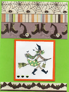
This last card features a Hero Arts witch from an older clear set.  I stamped her in black and then colored her with neon inks with my Fantastix blending sticks.  Also the bats' eyes!  You can see that I colored the ghosts eyes in the card above the same way.  


I love my neon inks!  I got all the colors:  yellow, green, orange, pink, blue, and purple.  And I am so glad I have them in time for Halloween.  They are the perfect colors for the season.  I am now looking for all things neon--papers, markers, embellishments.  I think they are my new fave!  Happy October!


Monday, September 17, 2012

Inchie Art

Since I have an Inchie class coming up Saturday, I thought I'd share some Inchie projects I have done in the past.  What is an Inchie?  It's a tiny 1" square work of art, either created on it's own or punched from a larger piece of art.  It can be part of a grouping to help build a card or scrapbook page, or just be a clever stand-alone piece of art.
This first piece is a thank you card made from a clear set of stamps from American Craft.  Very purple!  I like the dimension I built into the card using pop dots.  I also like how I made the THANKS greeting into two inchies with a punch stroke!  Some of the inch squares are stamped, some are run through an embossing folder, to give variety.


The next card uses some kitchen paper and a set of clear stamps from Amuse with a kitchen theme.  I thought of a kitchen cabinet so I encased my inchies into a "cabinet" I made with narrow strips of foam.  Again, I liked using pop dots to raise some elements of the squares up for dimension.  Lots of delicate cutting on this piece!  Another unique feature of this piece is how I cut up bits and pieces of a discarded dictionary to add text elements.


This last card uses the foam strips and the text elements used above but this time makes a dress shop "window".  The stamp is a row of cute little girl dresses, each stamped on inked and distressed paper.  


Inchies are one of my favorite art forms.  I love arranging those little squares into mosaic style cards and scrapbook pages.  I read on a Flickr Inchie site on the web that you can keep your Inchies in coin collection plastic pages--the size for quarters.  Inchie supplies can be bought from Ellen Hutson LLC, who stocks items from Inchie Arts and Lockhart stamps.  Inkadinkado makes a lot of Inchie clear stamp sets--the easy way to approach Inchie Art!  Good things come in small packages!


Tuesday, September 4, 2012

Crown Jewels ATC's


The theme for this month's ATC trade was "Crown Jewels".  I made all sorts of glittery goodness, as you can see in the photo above.  I used 2" sized chipboard squares and heat embossed them with Clearsnap Copper pigment ink and a combination of Ranger UTEE, gold and copper embossing powders.  While the layers of embossing powder were still hot I impressed a crown stamp (Postmodern Design) into the molten mess.   I then used red and ginger alcohol inks to add to the color.  This is a very fun technique--making deep thermal embossed tiles.  The fun part is sprinkling in all sorts of different powders for a unique look.   To further embellish the tiles once they were on the inked, stamped, and be-ribboned cards, I added tiny gold beads with Glossy Accents as an adhesive.  They really look like treasure!  Lastly, I composed a bit of prose to add some text to my creation.  I had fun at the trade.  All the cards were imaginative and the company fun to be with.  ATC's--a way to share your art with others.

Saturday, September 1, 2012

Halloween Shadowbox: Thank you Memory Box!


I have wanted to make this Halloween shadowbox ever since I saw it on the Memory Box Blog.  Last year I even ordered most of the stamps to make it.  I worked on it yesterday at Karen's fun craft room and finished up today.  It has lots of Halloween gleam and glitter.  You can see the original at this link:  Memory Box Spooky Printer's Tray    I used a printer's tray from Hobby Lobby instead of the 7 Gypsies one used in the original project.  The basic papers I used were from the Memory Box Nightfall collection.  I added stamps from Hero Arts, Inkadinkado, and Amuse in addition to the ones from Memory Box.  I did not have any Halloween Design Adhesives, so I used strips of green glitter paper for sparkle.  I also wanted some text, so in addition to some stamped words, I used a Cricut cartridge called "Word Collage".  The Halloween selection was perfect!  I cut some text in black and some in orange glitter paper.   All background papers were adhered with Perfect Paper Adhesive Matte from USArtquest.  I used a foam brush to apply the adhesive directly to the shadowbox.    Here are some closeups of various sections:


In the section above, I worked at the "Spooky Collage" technique, which is shown on the Memory Box blog.  It was a lot of fun!  Karen and I made three spooky collages and used one of them in the Shadowbox.  It is basically a technique where you make a "waxy buildup" of clear embossing powder, stamp on top of it in black ink, and then embellish with alcohol ink.  You can check out the technique specifics here:  http://davebrethauer.typepad.com/stampcolorcreate/2010/08/the-spooky-collage.html  Karen and I found that the collage stamp worked better if you used pigment ink and then heat embossed it also in clear ink before adding the alcohol ink.  We just had to be careful not to let the built up pool of clear melted powder melt any further!  This way we didn't have to wait for the ink to dry before adding the alcohol ink.


In the section above, you can see the very cool "cat in the spotlight" technique, which is described in the original Memory Box project here.  I used Tim Holtz Black Soot (a freshly re-inked pad) and a foam applicator to make the shadow.  I masked the spotlight with Eclipse Tape.   Can you find the following:

  • hanging ghosts from Penny Black embossed in white?
  • an orange glitter moon behind an Inkadinkado haunted mansion?
  • some owls displayed in front of some shiny orbs painted with Smooch paint?


In the section above you can find some spooky Inkadinkado spiderwebs heat embossed with Mystic Fire embossing powder from B & J Art Stamps.   You can also see a golden Hero Arts chandelier with some colorful Stickles accents.

Lots of fun!  I really enjoy making these.  I had intended it for use initially to house my Hallmark Merry Miniatures Halloween collection, but they just didn't look right and some were a little large for the printer's tray.  So my next idea is I will use it to house Halloween costume jewelry I have collected over the years.  That will make it very sparkly!  If I adhere the jewelry pieces (pins, earrings, etc) with hot glue I don't think it will get damaged if I ever decide to wear any of it again!  I prefer to look at my jewels rather than wear them on my person any day!  This project will be a great backdrop for my pretties!


Thursday, August 30, 2012

Is it time for Fall yet?????


Is it time for fall yet?? I keep waiting for that hint of cool in the air--sometimes I can almost feel it on my morning walks, but this morning was just too warm.  I am always eager for a change in season, especially fall, which is my favorite time.  It can't get here fast enough, since we are all tired of the hot summer heat.  The card above depicts my all time favorite go-to stamp for fall--Hero Arts F5270--Traditional Pumpkin.  I have had it for some time and I think used it for fall cards for the last three years.  Yet again, I drag it out, and do the same old technique I love--paper piecing beautiful fall printed papers.  This time the papers are from Cosmo Cricket's Nutmeg collection--another 6" x 6" pad waiting in my vast stash to be used and made into something beautiful, cute, memorable, or useful.  I paired this stamp with some new findings in my craft room--my not so recently acquired but still waiting to be used ZigZag stamp from Hero Arts (CG422) and my newest acquisition--my button studio from Epiphany Crafts.  (An item which I have mixed feelings about--certainly overpriced for the simple job it does not quite as well as I would have liked, but oh, well, it's a new toy and I can use it.)  The sentiment on the card is from Hero Arts' Season of Giving clear stamp collection, and the felt leaves I believe are also from Hero Arts.  I stamped the zig zag background with three colors of Clearsnap Colorbox Fluid Chalk ink-Pumpkin Spice, Yellow Ochre, and Olive Pastel.  A few ties of May Arts twine pulls the card together.  I love Bazzill paper for cardstock for cards!  I didn't even have to use a score tool on this--it just folded nicely!  I think I read that Bazzill papers have polyester fibers in them--maybe this is why it folds so nicely.  Not a perfect card--I see mis-alignment rampant and I had to use an orange pigment pen to get the sentiment to look decent, but I like it.  It reminds me of fun autumn times ahead and the promise of a little cooler weather.   Let's taste the last of the summer heat, maybe let it linger in our mouths just for a while, but let's wash it down with a draught of cool autumn.

Wednesday, August 15, 2012

School Days Shadowbox


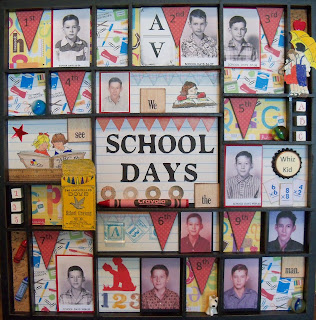
This shadowbox showcases pictures of my husband's grades 1- 10 above.  My mother in law gave me these pictures a number of years ago (quite a few years, acually!) and I decided it was time to do something with them.  I have had this idea swirling around in my head for some time, ever since the Graphic 45 school stamps (which you can see in the project) came out.  I used muted tones of red, blue and yellow as a backdrop for the pictures.  In addition to the stamps, I used some computer generated embellishments as well as purchased ones.  I am thinking I should make one of these for my school pictures, or my son's, if I am organized enough to find them!  I should get the shadowboxes started first, then add the pictures as I locate them!  Sometimes we're so busy living life it's tough to think about saving our memories, but my husband really did like the presentation and I think it brought back some memories to him. 

Thursday, August 2, 2012

Chip Decor


I have discovered Chip Decor from Hobby Lobby is fun!  This is a gift I am making my sister for her birthday.  I painted the edges of the shape black, then used the Chip Decor Cricut cartridge to generate the word from scrapbook paper.  Since I didn't have a printed 12" x 24" paper, I just abutted two 12" x 12" papers together and it ran fine.  I bet you can't tell where the papers meet!
     After applying the paper to the chipboard shape, I decorated it with black and white stickers and other little bits, including some gold embossed butterflies.  I do wish I had embossed before applying the paper to the shape, but it did work out fine.  I used the same cartridge to generate the letters of the family member's names, using a 3/4" setting from black cardstock.  I found some tiny metal frames and added the pictures of each family member.  Some pearls and stickles finished the project.  Voila!  (I hope she likes her present!)

Tuesday, July 17, 2012

Gearing Up


This week I am playing around with borders and backgrounds, in preparation for my class this Saturday.  I wanted to use this gear stamp (in orange above) from Stampabilities.  I had this image of large colorful gears arising from the smaller gears in the stamped image.  Alas, no large gear stamp!  No gear chipboard shapes! No gear die or punch!  But wait--I did have a gear die--from Tim Holtz, and it was perfect!  Well, not perfect--it was an on the edge die--I still haven't invested in his larger gear shape (which I do see coming to my craft room soon, along with lots of robot stuff--don't ask me why).  The only problem with this die was that it did not cut out a complete gear shape--only the tops.  I played around with forming a complete gear shape from two cut ones--that didn't look so good.
     But actually, the on the edge die did work, as you see in the project above.  I cut the shape in various primary colors and added them to the card--on the edge!  Success!

Sunday, July 8, 2012

Denami Blog Hop: Summer


Welcome to the Summer DeNami Blog Hop!  You should have arrived here from Lisa's blog at  http://mypapertales.blogspot.com/.  If you get lost during the hop you can always start at the beginning: http://www.denami.blogspot.com/ 


I thought this would make a super "Have a great vacation" card.  I stamped the shirt three times on Basic Grey patterned paper with Colorbox pigment inks in various colors and then heat embossed them.  The palm tree is stamped in green and brown Colorbox and heat embossed then colored in with green and brown pigment inks with the Colorbox stylus and heat embossed again to set the inks.
     The background for the large 5" x 6 1/4" card is covered with square "tiles" of various colors of Basic Grey cardstock.  The tiny tiki hut was stamped with Memento brown ink down the center tiles.  After adhering the shirts and pine tree I computer generated the sentiment and printed it on Basic Grey yellow card, added a tiki hut and a fish brad.
    Are you packed for your vacation yet?

Now it's time to visit Linda at:   http://creatingingodsimage.blogspot.com/

Wednesday, July 4, 2012

Colorful Flamingo


Happy Summer!  And this cute little flamingo is coming your way to help you enjoy the beach, vacation, picnics, ice cream, or whatever helps you beat the heat this summer.  I loved coloring this little guy with my Copic markers.  That's a good thing, since I had to color three or four images of the flamingo to layer it properly!  There are three distinct layers to the flamingo, each one held in place with dimensional tape.   And no, you are not seeing things!  I did "alter" the image by adding a few extra leaves in extra places.  I wanted very lush foliage!  The central flamingo image and green border are cut with Spellbinder's Nestabilities dies.And thank you, my little Cricut!  I cut the white lacy background from the Cricut Paper Lace cartridge.  I think it is called Blossom1, and I cut it at 5 1/4".  I also cut the label for the sentiment from Accent Essentials, altering it in Cricut Craft Room to make it fit the sentiment better.  I added a layered flower and some pearl accents with the Viva Decor Salmon Pearl Pen.  If I can't go to Disney World this summer, I can at least color my world as if I were there!


Friday, June 29, 2012

Leftovers


I rummaged through a box of unfinished cards the other day and decided to finish one!  This is of course a design from a previous Card Factory class I did.  I think some rhinestone bling will add a lot to this!  Aren't those Copic colors vibrant?
     It seems like my life is full of leftovers these days--leftover class kits, leftover supplies I thought I needed but really didn't, leftover debris from my last crafting project,  leftover over food in the refrigerator because the restaurant served too much or I cooked too much!  Do you have leftover gift bags that just seem to hang around and never seem to get used a second time but are too good to throw away?   I just pitched a bunch of leftover gift bags and other debris cluttering my closet.  The recycle bin is now full and I feel a lot better!  Now I have to set my mind to finishing all those unmade cards and sending them out. (No, I am not throwing those away--I will let the recipients do that for me!)  A simple thing--decluttering.  Take joy.

Sunday, June 10, 2012

Denami Blog Hop June: Cards for Guys


Welcome to my entry for the DeNami Cards for Guys Blog Hop!  You should have arrived here from Lisa's blog:   http://bellalistona.blogspot.com.  If at anytime you get lost or want to start over, here is the main link to the Blog Hop:   http://denami.blogspot.com/2012/06/cards-for-guys-blog-hop.html

I know all the guys want to go to tropical islands and relax in hammocks and drink exotic concoctions and be fed fruit by beautiful girls (yeah, yeah--dream on....!)  So I decided to use the DeNami pineapple stamp as the focus of my blog hop projects.  


Directions:   Ink pineapple with yellow ochre and olive pastel colorbox chalk ink.  Stamp repeatedly over the front of a yellow A2 notecard.   Stamp sunny days with black dye ink on a yellow strip.  Back with a peachy-orange strip of Basic Grey cardstock.  Center onto notecard.  Attach a strip of printed paper tape (This paper tape was a lucky find at Target--I think it's a kind of Washi tape) with a peachy color print.  Stamp three separate pineapples with same ink onto white card.  Color with Copic markers, then overstamp again with the same inks to give emphasis to the stamp lines.  Cut out the pineapples and attach with dimensional tape to bottom center of card front.


Same stamp, different take:  Cut  1 1/2" squares of lime-green Basic Grey cardstock and also of peach.  Cut the peach triangles in half and lay on top of the the green squares.  Attach all to a 3" square of white card in the manner shown.  Stamp pineapple in the center.  Stamp pineapple also on peach card, cut out fruit portion and piece onto the stamped center pineapple.  Attach this square onto a white notecard covered with Basic Grey printed paper.  Punch 1" squares of green and peach card.  Attach these along a narrow white strip of white card to make a border.   Stamp "sunny days" along border.  Draw "stitch" lines with a black pen around "quilt pieces".


Take 3:  I have been playing around with some sketches I designed.  The sketch I used in the card above was originally designed for the Tim Holtz' Umbrella Man stamp.  I adapted the design to suit the pineapple.  First, instead of using actual book text paper like I did in the original, I printed out vacation words on the computer to a text box and then ran them on some text weight linen paper.  This was used as the left border of the card.  I then stamped and heat embossed the pineapple in copper on peach card and matted it with black.  For the lower border, instead of using tissue tape, I used some Basic Grey printed cardstock.  OOPS--I got the border a little crooked.  ( I had wanted to use the Target paper tape I used in card 1 above, but it looked washed out over the text.)  I forgot to say that before I started decorating my card I first printed the sentiment onto the card with my computer. The card looks peachy in the sample above but is actually manila.  I generated the scallop border with my Cricut Ribbons and Rosettes cartridge and laid it over the text box edge.

Here is the original card I designed this sketch for, and you can compare how I adapted the sketch to the DeNami image:


Thank you for looking!  I hope you have come away with some fun ideas.  Don't forget to leave a comment, because prizes are being given away!  How do you think I get my stamps?!!!

To continue the Blog Hop, you will visit Christine at http://christinezani.blogspot.com/


Saturday, June 9, 2012

Two Items of Note

DeNami June Blog Hop

Note 1:   Join me tomorrrow for the June DeNami blog hop featuring Cards for Guys.  Any comments posted on my blog or any of the participating blogs will be eligible for prizes from DeNami.  Last month I won a $20 gift certificate to their store and I bought some really cool stamps!

Note 2:  Check out my Class Information tab above to see the latest class sample.  If you love all things Tim Holtz you are going to love this upcoming class on June 23!

Sunday, June 3, 2012

Video: Card with Reverse Stamping


I love these red and black Jenni Bowlin papers!  They make me think of upholstery and wallpaper, so I combined them with Hero Arts Wishing You Were Here clear stamp set CL480.  I like the idea of the chairs facing each other, so I decided to do some "reverse" stamping.  Here are a couple of videos that show how I started the card and did the reverse stamping:

The first video shows how I organized the card itself:  Watch at YouTube:


This video actually contains the reverse stamping: Watch at YouTube:


To finish the card, I added a black border cut from Cricut Ribbons and Rosettes cartridge, added a "rug" and a table, and put accents on the chandelier with Viva Decor Pearl Pen in Ice White and gold Stickles.
Thanks for looking!

Friday, May 25, 2012

My First Video

And the first thing I learned--don't name your upload "Joy Ride"!  Which is of course the name of the Hero Arts stamp set I am using!  Now I have to go back and re-name--hope I can.  Lots to learn--like omitting all the "and so thens" from my audio presentation.  But the card is kind of cute, I think!  Watch at YouTube to see full screen.


 Watch at YouTube

Sunday, May 20, 2012

DeNami Blog Hop: Pretty Pastels


Welcome to my entry for the DeNami Pretty Pastel Blog Hop!  You should have arrived here from Michelle Gross:  http://studiomsg.blogspot.com/

I am really excited to be part of this hop--it is my first Blog Hop and thank you so much for participating!

Here is my first card:  


For this hop, I wanted to do some embossing on vellum.  I used Denami J30 Tulips and stamped on a vellum overlay with first Lime pigment ink from Clearsnap, and then with Orchid pigment ink from Clearsnap.  I used a stamp positioner to form the layout of the tulip trios, and then stamped each in turn, taking time to do the green leaves first, and then the pink flowers.  It took 6 passes, but I think they each stamped and embossed cleanly this way.  I then colored the back of each tulip, turning the vellum over, with coordinating colors of Tombow markers.   I then adhered the panel to a pink A2 notecard with Xyron adhesive.
     Next, I heat embossed CL-GD002 Spring Garden canopy using white ink and white powder on a separate vellum panel.  I again colored the back of the vellum with Tombow markers.  I cut out around the scallops and then adhered this panel below the tulips with Xyron adhesive.  Last, I stamped F148 Thanks a Bunch at the bottom of the notecard with Memento Rosebud permanent dye ink.
     This card is great when you need a flat card for mailing purposes.    The only dimension is in the heat embossing but the embossing gives it a lovely dimensional look.

     But, you might like a more layered look.   Here is another card with the same materials and the same technique, but the card has more layers.    This time I did not adhere the vellum with adhesive, but used a folded peice of vellum, laying it over a white notecard and attaching it with a ribbon.  I added a few extra butterflies this time from the Spring Garden set, and stamped the canopy with Orchid pigment ink before heat embossing with clear powder.


Thank you so much for looking!  Here is your next stop on the Blog Hop:  Tammy Hobbs at:   http://somewhereunderthesune.blogspot.com/

If you get lost along the way, you can always return to the DeNami site to get re-directed:  http://www.denami.blogspot.com/

Be sure and leave a comment if you want to be entered into the drawing for the prizes!

  Happy Hopping!

Wednesday, May 16, 2012

Joy Ride


Getting ready for Saturday!  This card shows a white embossed background, sponged with green ink.  The central motif is one bicycle deep embossed to make a tile.   I used matboard for the tile base and several layers of embossing powder for the tile.  I did add colored pencil to the image before embossing, and you can see the colors did not bleed.  I hope things are moving along for you!   Don't get run over in traffic!  Sometimes it seems like I'm just one roll of the wheel ahead!  Keep moving!

Friday, May 11, 2012

Happy Mother's Day!


Tomorrow I will be presenting this card.    I saw a card on the Hobby Lobby Facebook page a week or so ago that used this die, and I decided to go with a sewing theme, too.  I used Girl's Paperie as the background, and then inked around it with Vintage Photo Distress Ink.  I cut the mannequin from Tim Holtz' Sewing Room die, and the scissor cut out is from the Cricut Sentimental's cartridge.  I distressed both with crackle paint.  Adding a lot of Tim Holtz embellishments completes the look, along with some stray buttons.  The inside features the same die cut with a special greeting.  I know sewing was really big with my mother and grandmother, and I used to sew a lot when my son was little. I made all his Halloween costumes and even some of his shirts.  I like the saying:  "Women are like buttons...they hold things together."  I hope you have a happy Mother's Day tomorrow, whether you are a mother, daughter, grandmother, or just a special woman in someone's life.

Tuesday, May 1, 2012

A Touch of Whimsey


Happy May!  I worked up one of my favorite subjects for this month's tag swap--the majestic peacock!  The theme was embossing folders and/or die cuts, so I used both.  I had this peacock die from Cuttlebug for a long time and never used it (sound familiar?!) so I decided it was time for him to go to work.  I first applied Evergreen Bough, Broken China, and Peeled Paint distress inks to the tag, spritzed it with Green Patina Perfect Pearl Mist.  After it was dry I ran the tag through a Tim Holtz damask embossing folder.   I cut the peacock from turquoise cardstock, the leaves from green, and the damask element at the top from gold.  It was work getting the little tiny pieces pulled from that peacock die!  I traced around the inner body of the peacock to make a template of white card and painted Radiant Pearls in shades of blue, green, and purple.  While that was drying I assembled the tag.  The leaves have InkaGold applied to them, in a shade called Lava Green.  I don't know what happened to my gold InkaGold--it completely dried up.  What's up with that?  I haven't even had it but about nine months.  Anyway, the lava green looks gold.  The bottom border is cut from that wonderful Royal Garden paper pack from DCWV I got from JoAnn's a few months ago.  I love this paper, and use it sparingly.  After putting the peacock together I added a few touches of Stickles, Smooch, and a few rhinestones.  The stamp is from Renaissance Art Stamp.  I used Stazon Jet Black because of the slick nature of the cardstock.  He sparkles!

Monday, April 30, 2012

Happy as a Clam!


It's ATC time again, and one of the themes is "Build a Scene".  My friend Karen had this marvelous Sea Horse stamp from Gina K Designs, and when I saw it, I immediately thought of using it on my ATC.  She also had the Stampendous goldfish clear set, and I filled in elements from that.  Lots of Stickles later, here is my ATC "Build a Scene".  I rummaged all through my stash for an appropriate saying, and found this one in a little box of sayings I got from Stampin' Up years ago.  The sayings came as one stamp, but I cut each one apart and I just use a little bit of dot runner to attach them to an acrylic block for stamping.  I think the yarn makes excellent seaweed on that sandpaper sea floor!  The background of the ATC is brayered Tsukineko Kaleidacolor "Fresh Green" onto glossy cardstock.

Saturday, April 28, 2012

Denami Challenge: One Layer Card


This one's just for fun!  I have absolutely no (well, maybe one) DeNami sentiment stamp, so I saw on their blog someone had hand-written a sentiment.  So I decided to have some fun.  What did the first swan say to the other?  "Hey, I used to think you were a duck!" Corny, I know, but fun.  The rest of the inside greeting says,
"I hope you have a happy, fun-filled birthday!".  Who wouldn't want to get this card?  I think sometimes as cardmakers we focus on the pretty outside scene, when people would really like a little smile or grin.  Now, the front of my one-layer card was very pretty before I added my choppy little writing.  I drew some clouds to use as a mask and sponged around them with Broken China Distress Ink.  The actual card is glossy, so the dye ink really pops.  I gold embossed the swans and then masked them to sponge the sky and water.  (Yes, that is water below the swans--their lake is rather greenish!)  I then did get a set of cling DeNami stamps recently with a few little butterflies.  The only thing is, there was a flower amidst the butterflies, so I promptly cut that part of the stamp off so I could make bunches of butterflies.  These are stamped in black and colored with Tombow watercolor markers.  So what else could one swan say to the other?  "W-a-a-a-y down upon the Swanee River....!"

Wednesday, April 25, 2012

Looking Clearly at Clearsnap: Happy Fiesta!


Happy  Fiesta!  This little card is one of a series I created with Fiesta greetings in mind.  The design is the current layout challenge from Hero Arts:   http://heroarts.com/blogs/club/april-2012-contest-details/
I used various colors of cardstock, cut them into rectangles, and then inked them with coordinating colors of Clearsnap chalk ink.  Since the featured stamp is a clear set (Hero Arts CL510) I wanted to stay with pigment or chalk inks.  I like how these inks provided a tone on tone look as I chose colors to match the papers.  The inks did not disappear into the paper, like dye inks would have.  The scallop circle dies are an older set I own from Quickutz, now Lifestyle Crafts.  The center circle punch is an EK Success nesting punch in a 1 1/8" size.   I love using a circle punch to punch out an already stamped saying. Even with using a clear stamp, it's very hard to stamp right in the center of a small circle!  As a finish to a festive look, I added little sparkly gemstones all over the card.  Enjoy!

Friday, April 20, 2012

Card Patterns Sketch 161

Here is Card Patterns Sketch 161:


And here is what I did with it:


I needed a "wedding" card for an upcoming class, so I used black and gold for my base.  The stripe cardstock is from Reminisce, and the gold metallic is Bazzill.  The interior scallop is Bazzill mirror gold, and the interior patterned circle is Autumn Leaves.  The die cut letter is Quickutz.   I couldn't wait to use my new Ornamental Iron 2 Cricut cartridge, so I cut some flourishes from black card.  The interiors of the flourishes looked like hearts, so I thought, how appropriate for a wedding!  I backed the "hearts" with pink card, and added a perfect sentiment from an older Hero Arts cling stamp set.  You never know what you are going to need!  The little dots of Pearl Pen from Viva Decor complete the project.  I can see this card made into other papers with different color schemes and maybe a central picture image, rather than a letter die cut.  This sketch is so versatile!  The best part:  I already have a vellum envelope to fit!


Friday, April 13, 2012

Card Patterns Sketch 160


I just got this sentiment stamp from Inky Antics, and I just love the quote.  I don't know if you can see in the picture above, but when I watercolored my stamp direct to stamp from marker, I spritzed it with Ranger Perfect Pearl mist before stamping.  Also, this is a second generation stamped image, so the colors are quite muted.  The stamp image is called "Efflorescence" from Penny Black.  I think it is a lovely image and I have spent quite some time coloring it with watercolor markers.  Yes, I still use my Tombow watercolor markers.  I love them!  I tried out three or four different stamp images for this card, and I think this one works the best with the flowers, which are required for the sketch.  Here is this week's actual sketch from Card Patterns:


I turned the sketch to be landscape format, to suit the format of my stamped image.  That made it a little problematic for my sentiment, which I had first chosen to be on this card!  I hope you find it pleasing how I worked out all the elements.  Thanks for looking!