Saturday, August 29, 2015
Stamp A Faire Threads Challenge
Another technique new to me from this year's Stamp A Faire from PaperTrey Ink is the use of "thread nests". They are very cute and do look like little bird's nests. The best thread to use for this technique is thread right off the spool, because it curls so nicely. Here is a link to the videos that showcase the use of the thread nests:
http://nicholeheady.typepad.com/.a/6a00d8341c64e753ef01b8d14fdd47970c-450wi
There are two videos--the first shows how to make the thread nests. Thank you, Laura! and the second video showcases using twine on cards. Thank you, Danielle!
I used a combination of the techniques on the card above. What goes best with thread? Buttons! I used a different window card this time. There are three small window circles along the edge of the card. I filled the circle areas with thread nests and antique buttons.
The other side of the card features Anna Griffin paper, a Tim Holtz sewing room die, and a Paper Trey Ink button card die and stamp (I love this set of stamps and dies!)
I used rather heavy twine, and it was hard to lay down. I used glue dots beneath the buttons and a bit of Glossy Accents to hold down the twine, but this twine is hard to grab with the Glossy Accents. It took a lot of patience, and if I do give this card to someone (can't really be mailed because of the bulk) I will have to secure the twine better.
I am really enjoying the Stamp a Faire videos today!
Stamp a Faire Mix and Match
https://www.youtube.com/watch?v=_zem3Ka3uJQ
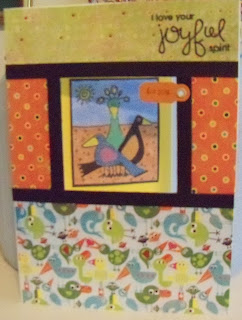
I had laying on my desk some patterned papers from a Basic Grey / Hero Arts paper pack and I looked at them and thought, "These are just like what Betsy was talking about--a large, medium, and small print. I actually had used them in a previous project--that's why they were just laying loose. So I grabbed them and started thinking about my card.
Remember, I am trying to use my window dies, and for lack of a better thought, I decided to cover the front of the window card with these papers. I did just what Betsy said--I used a larger amount of the largest print, a middling amount of the middle size print, and a smaller amount of the smallest print. My card reflects the sizes of the prints from top down (or bottom up, if you prefer). And because the largest print was of funky looking birds, I also grabbed one of my favorite stamps--funky birds! This is a Magenta print, and I thought it would be perfect for my card. I stamped the image in Memories black ink, coloring with Copic markers and the new Kiryana (sp????) metallic markers. My image is so bright and colorful! After trimming and attaching the stamped image to the inside of the card (mounting on a background of bright yellow), I felt the card was a little plain. So for some drama, I added narrow strips of black cardstock. These strips really set off the sunshiny yellow and orange. I also stamped a Paper Smooches sentiment in black ink. Lastly I added a Tim Holtz tiny tag, stamped and set with a green eyelet. Oh, did I mention I really put some window plastic on the window. Covering the entire front of the card allowed me to do this easily. Who wouldn't want to receive such a bright and colorful card?! Here is a peek at the inside:
Stamp a Faire Pattern Challenge
I didn't use my window dies for this challenge because they didn't really fit the offered patterns, so this card is a little smaller-A2 size to match the Paper Trey Ink patterned paper from the County Fair Make It Market kit I got last year. I love this stamp set! And this card would be perfect for a birthday card. Here is the pattern I used:
Of course, Melissa's card is all girly and feminine, and very beautiful (I love the pumpkins!) so you have to look closely to see that mine fits the pattern. You can see her card here:
http://lilybeanpaperie.typepad.com/lilybeans_paperie/2015/08/saf-2015-patterns-challenge.html
All items on my card are from my kit, with the following exceptions: white cardstock, red cardstock, Colorbox chalk inks, colored pencil (to enhance the ink), and few dots of dimensional pearl paint. And doesn't this card look pretty next to my chalk painted Mason jars! (Not yet distressed, so I will post about them later.)
Hooray for summer, sunshine, and fun!
Paper Trey Ink StampaFaire 2015!
Now, of course, I have lots of cut out bits and pieces to make several wedding cards! Anybody planning one in the near future? I have your card ready!
Thursday, May 21, 2015
Faux Stained Glass project
Many of you may not know that I have started helping out at a children's church on Sundays. This was one of the first projects we did. The lesson was the story of Abraham, so we did some star projects. Also, the church has been holding sermons featuring the stained glass windows in the church, so this project was appropriate.
I used my Cricut Explore to cut the black design from cardstock. The star measures about 9" wide. We attached the die cut star to the sticky side of clear contac paper, then used bits of tissue paper to add color "stained glass" to the sticky side. The finished result really looks like stained glass from the front side. The project was easy and simple for the kids to do. I hope everybody had fun! I had seen this project on multiple websites, each with a little variation. My variation was using my Cricut Explore and a Cricut image to cut the design. I love having my subscription! I get tons of "free" images to use!
Wednesday, May 6, 2015
Dauber Fun
Last week I tried a technique that was showcased on the Hero Arts blog. Here is a link to the original post: http://heroarts.com/blogs/club/page/4/
But it is difficult for me to use the distress inks with the ink applicator these days due to neck and arm problems, so I decided to use daubers instead.
I first stamped a panel with a sentiment from Our Daily Bread (Thank you, Donna, for the loan of these stamps!) using Clearsnap fluid chalk ink.
I then masked the sentiment with a rectangle of Eclipse masking tape. (You could also use a post it note.)
I then stamped a Hero Arts large cling stamp pattern (I used large Lotus blossom) using white pigment ink and white embossing powder over the mask.
Keeping the mask in place, I then rubbed a liquid ink dauber over the embossing to color the background paper. Let dry, and then remove the mask and attach the panel to a notecard.
You can see in the picture above (the blue one) that my first attempt at this technique was not really successful. The background stamp I chose for this one was not bold enough. The technique works better with a bold print background stamp.
Here are the color combinations I liked best:
Lipstick Red chalk ink paired with Fired Brick Tim Holtz dauber.
Yellow Citrus chalk ink paired with Mustard Seed Tim Holtz dauber
Warm Green chalk ink paired with Peeled Paint Tim Holtz dauber
Labels:
Clearsnap,
heat embossing,
Hero Arts,
resist,
Tim Holtz
Thursday, April 23, 2015
Trifold card
This card pictured below is a new design for me, although the design is very popular. The unique thing about this card is that the structure can be cut with a Cricut. I downloaded a file shared by one of the owners of the Cricut Design Space Lover's Facebook page. The file cuts the card and the mats perfectly to fit an A2 size, and it is all done electronically. One 12" x 12" page will give you two card bases. The card folds flat for mailing, but opens up for display.
The little flamingos decorating the card probably look a little familiar to you! I cut them from the card design used in a previous post and turned them into single images to use on other cards. The card is designed so a lot of writing can be put on the last panel, but I narrowed it to a single strip so that I could add an extra flamingo.
Here is the link to the website from which I got this file:
Labels:
cards,
Cricut Design Space,
trifold shutter card
Monday, April 20, 2015
100th Birthday Party
Tomorrow I am going to a 100th birthday party for a woman here in town. I have never even known a person to live to 100 before, so I am very excited and happy for her. I decided to make her a special card:
I used an Anna Griffin Make It Now card from the Cricut Design Space website and added my own flowers and greeting. The greeting is printed on the tag with gold ink and then cut, using the Write and Cut features of the Explore. I made the flowers from a Spellbinder's die and spritzed them with Heidi Swapp gold pigment spray.
I hope Eve likes her card! I have to come up with an inside message now. That will be the really hard part!
Thursday, April 16, 2015
Tickled Pink
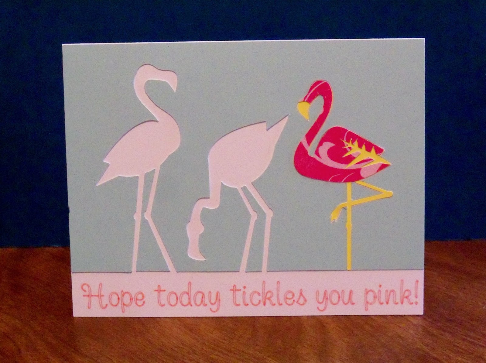
Today I am sharing a card I found at the Cricut Explore Design Center Make It Now website. I changed it up a little bit, adding the text at the bottom of the card. This card was very fun to put together, kind of like a little puzzle. I do love that the Explore can write on your project. Those of us with not so perfect handwriting and not wanting to continue to buy stamps really appreciate this feature! Of course, I probably could have just used a computer, but I got to use a cool font in pink! I think this card would make an awesome hello or even birthday card. There are tons of cards on the Make It Now website--this one is only the tip of the iceberg! All the work done, I just get to play!
Tuesday, April 14, 2015
Special Delivery Birthday Balloon
Here is a fun birthday card I put together recently. I got ideas from a number of sources. I saw a video by Jennifer Maguire where she glittered a word diecut letter by letter and then raised it up on a foam diecut. I die cut my words from Cricut and built up layers of cardstock--I think about 4--glittering the top layer letter by letter. I tried making the balloon with cardstock, but it was so thick it wouldn't fold nicely so I used paper from Hobby Lobby. Again, the die cut is from Cricut, and you have to make 3 layered balloon images to make it 3D. I got the idea for the saying on the front of the card from Pinterest, and I let my Cricut do the writing! So much nicer than my handwriting! I love this writing feature of the new Explore! The whole card was very easy to design in the Cricut Design Space.
Sunday, April 12, 2015
Belated Easter post
Easter went fast this year! We did finally finish eating all of the Easter feast by about Wednesday, though. This little project was done for a craft activity at a local children's Easter Egg Hunt. While all ages could participate, the real devotees were little girls about 9 or 10 years old. Oh, I found out Washi tape is a real hit with kids!
The first thing everybody did was make a small Easter basket which I had pre-cut from a Cricut file. The children then decorated their basket with washi tape. Then we decorated some eggs with washi tape to put into the basket. We used plastic colored eggs (of course!) although the washi tape looks really brilliant on real white eggs. The children loved tearing off that washi tape and covering everything with it!
This little banner was the highlight of the day (after the egg hunt, of course). I cut out some Easter egg shapes from a Cricut file, and some lettering to spell out EASTER. We covered the eggs with strips of colorful washi tape, backed the eggs with some scrapbook paper also cut into the shape of the eggs, punched some holes, added our lettering, and ended up with a really cute little EASTER banner after adding some colorful ribbons. Some of the younger children, or those with limited time, just made one egg shape and then put a pretty butterfly sticker on top for a colorful Easter ornament.
Friday, April 10, 2015
Cake Pop Up Card
Here is a video detailing my efforts at making a pop up cake card using the Cricut Everyday Pop Up Cards cartridge. I cut this pop up with my Explore machine. Using the stylus really helped with some of the folds, although not all of the folds are given a score line in the program. The Explore helped a lot with making the parts sized perfectly for each other so the parts fit together properly. No, I have not finished decorating my card. I still have the front to do and I want to do some more decoration on the cake and the inside of the card as well.
Yes, I know the video is not perfect, and yes, I did move off camera for a little bit, but I think you can get the general idea. Remember, my camera equipment is not the best in the world. All my money goes toward my Explore product needs!
Thursday, March 26, 2015
Quick Cards
At stamping group this past week, I spent some time coloring some flower images I had stamped out a long time ago. I used Copic markers. In the next few days, I spent some time picking out some coordinating papers and putting the images onto some cards. I needed some all-purpose cards I could use for get well, sympathy, and birthday cards at the spur of the moment. Here are the results:
It certainly helps to have a lot of tools to hanging around! I used a Martha Stewart border punch on the second set and a Sizzix rick-rack die on the first set. I also like having a lot of papers to choose from. I knew all those paper pads would come in handy! You just never know what you might need! I also found a little sentiment stamp from Hero Arts that coordinated perfectly. A little twine, a few buttons, and some glitter glue didn't hurt either. Now I am all set for when I need a card!
Monday, March 23, 2015
I hope your day is blooming pop up card
I made several cuts using the Cricut Everyday Pop Up Cards cartridge to make this card. Three cuts are used for the outside of the card: the window box, the flowers, and the stems. OK--I used a punch for the yellow flowers! The sentiment is from Paper Trey Ink.
Here is the inside of the card:
I found a wonderful tip on an internet blog which recommended glueing the flower stems to the window box, rather than have them flop around inside the window box, as the directions from Cricut state. When I used the Cricut directions, my flowers did not pop up, they just lay flat. With them glued to the backside of the window box (an extra piece glued to the front of the pop up) the whole structure pops up properly.
Below is a side view so you can see the pop up structure:
I hope you have a blooming day!
Saturday, March 21, 2015
St. Patrick's Day 2015: My lucky charm book
Here are some pictures of a little book I designed for a group get-together on St. Patrick's Day this year. It is a chipboard "lucky charm" book. Each interior page has a window cut-out with charms attached, so as you flip through the book, the charms play upon each other. Each page has also a little tag and an Irish blessing along with a little sticker. I got the little stickers from Hallmark years ago. I hope you have fun looking at my cute little "charming" book! I have yet to decorate the covers. I made two of these little books using the smallest page of my Accucut flip album die coupled with a single "Convertible" die for the cut-out. The pages are covered with various green/St. Patrick's themed papers I have collected over the years.
Labels:
Accucut,
charms,
flip album,
green,
Irish blessings,
St. Patrick's Day
Friday, March 20, 2015
Cricut Explore Birthday Card
I am always in need of birthday cards, so I jumped at the chance to make this cute candle card from the Cricut Design Space ideas. I have a subscription, so I didn't need to pay any extra for the design. I cut out two of these and will make many more. I also added some Stickles to the candle flames (not shown in the picture above.) I liked the idea of a design already planned out and ready to go, including the envelope. The Explore cut everything out fabulously and all the images line up perfectly. No sweat, no brain power, just simple crafting fun.
Labels:
Birthday,
Cricut,
Cricut Design Space,
Cricut Explore
Thursday, March 19, 2015
Showering Blessings
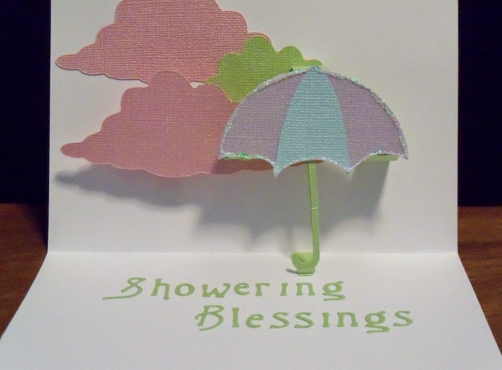
This little pop up card was fun to make, and is very pretty in pastel Bazzill Bling cardstock. I had leftovers from a couple of baby chipboard books that I made so I made some matching cards. The pop up umbrella is of course from Cricut Everyday Pop Up Cards cartridge, as is the layered sentiment on the front of the card. I cut the Showering Blessings from a thin die I have had for a while--cannot remember the name of the company--besides the company is called something else now. The buttons on the front of the card are cut from Paper Trey Ink button dies. A few stickles on my umbrella make it shine. I hope you have a sunshiny day, not a rainy one! Maybe this umbrella is more of a parasol!
Labels:
Bazzill,
Button Boutique,
Cricut,
Cricut Everday Pop Up Cards,
pop-up card,
shower,
umbrella
Saturday, March 14, 2015
Go Wild!
Here is a cute pop up card I made using a hodge-podge of stuff! I first made the giraffe pop up and then raided my craft room for "go withs". The card turned out to be a little large at 6" square, but the giraffe has a long neck! This giraffe was cut on my old Cricut, now retired, since I got the new Explore. I love the Explore! The cuts are perfect. I expect to make many posts about projects using the Explore, since I have played with the new machine almost constantly since I got it.
Back to the card--I used some two sided paper, circles on one side, solid on the other, a Hero Arts digital stamp, colored with Copics, a Hero Arts giraffe stamp, some Hobby Lobby border stickers to assemble the front of the card.
Here is the inside giraffe pop up:
Very fun!
Labels:
Cricut Everday Pop Up Cards,
giraffe,
Go Wild,
Hero Arts,
pop-up card
Wednesday, February 11, 2015
Sending a little love
I only made one Valentine card this year, but I made 15 of the same design. Here is the outside of the card:
This is a re-make of a card I designed several years ago. I re-sized it, using my new Accucut A6 window card die. The acetate forming the window is stamped with a Hero Arts collage stamp from several years ago, using Stazon black ink. All of the stamps featured on this card are Hero Arts.
I needed 15 Valentine's cards for young adults. Nothing frilly, fancy, or feminine, since the card would be received by males as well as females. I wanted to send the message that they are loved, so I printed that out on the computer and affixed it to the inside of the card so the message would show through the window as part of the design. I cut the brackets on the outside of the card using my Cricut Craft Room, making sizing a zip.
Here is the inside of the card:
I wish I could share all of the steps I went through to get everything matched properly and glued together so all of the pieces fit. Painstaking! The main problem was I needed to cut a white interior of the card while making the outside of the card red. It wouldn't help to use a red card with a white backing. I needed layers to fit my acetate window. I tried various techniques with each of the 15 cards, yet I know I will still experiment if I make 15 more (not happening!).
Labels:
Accucut,
Cricut,
Hero Arts,
Valentine,
window card
Monday, January 26, 2015
Chalkboard look mini book
I have wanted to make a chalkboard-look mini book for a long time, and I have been collecting supplies in a box for a few months. I really like how this little book turned out. I only have this one picture since this was a gift and I forgot to photograph. I hurriedly took this photo with my cell phone in the car before putting it back into the gift bag.
I used chalkboard papers from MAMBI plus solid chalkboard colors from DCWV. I used the flip book die from Accucut to make the chipboard pages and then covered the chipboard with the die cut papers with Mod Podge. The girl on the cover is a Cricut cut from the cartridge called Forever Young. She cut fabulously and was the perfect cover piece. The embossed words on the front are part of the MAMBI paper.
This album was extremely fun to decorate. I loved using the little enamel dots on the punched scalloped border. I made the red ribbon with my new Bow It All and used red line tape to adhere it in place. It does not go around the page because of the design of the backside. It instead adheres only to the front of the page. I held the book pages together with black rings from 7 Gypsies and decorated the rings with neon colored ribbons from American Crafts.
This album is a birthday gift to a teen age girl who has a ponytail just like the girl on the front of the album. I hope she enjoys adding her pictures. You can't see the little additions inside, but I backed MAMBI foil and glitter blackboard pocket sayings with the DCWV colored cardstocks and put several pockets inside to which pictures can be added.
I will definitely be making some more chalkboard projects. This one was too much fun!
Saturday, January 24, 2015
Fun in the Mail!
Look what came in the mail last week
I previously subscribed to Jenni Bowlin's Papercrafting Kit of the Month. This 2015 she has changed her offerings from papercrafts to collections. This is the first Magpie kit. Each month there will be a new collection of fun things that we can collect, collate, craft, or just crave! Here is the box as I opened it:
And below all the lovelies unwrapped:
There is an antique spoon, with a hole in the handle for hanging. There are three snowflake doilies, a train ticket, some antique sequin trim, three wood circles, a tiny china cup, a bottle of glitter, an antique cluster earring, and various and assorted ephemera. I love this stuff! I will definitely use it for crafting, and I am thinking a shadowbox of the month, each month featuring items from that month's collection plus other items from my stash. A couple of years ago I had bought a whole bunch of Tim Holtz' shadowboxes from Tuesday Morning and I am thinking this stuff would be perfect for those destinations. Now I can clean out one of the boxes in my garage!
Here is the link for the Jenni Bowlin site: http://www.jbsmercantile.com/
Tuesday, January 20, 2015
Wishing You a Whale of a Good Time Pop Up
This card was really fun to make, and I think pretty fun for a special little someone to receive. I think it could be appropriate for a birthday card, especially for a birthday visit to Sea World!
Again, I made the interior and then had to think a while for what to put on the outside of the card. As you can see, my trusty oval die cuts and computer have come to the rescue for a third time! I hope I won't get in a rut about those oval dies!
This card is an actual A2 size card, blue for the "water" background. I cut the whale pop up three times at 4.5" x 8.653": Blue, black, and white. I then worked out how I wanted my whale pieced and glued the pieces together. I think he came out having a little "angry" expression. I will see if next time I can make him happier looking! But the piecing and folding did work out properly. Again, I used temporary adhesive and a trial card base to get him situated properly. The pop up slots are folded right onto the background card, inside the "water" circle.
The outside of the card uses the "Get Whale" shadow option. I cut off the "Get"part of the cut after cutting in white. I also cut one in black so I could piece the whale's tale on the sentiment. The sentiment was cut 4" x 1.11" to fit at the the bottom of the portrait style A2 card. I added Stickles glitter glue in True Blue for the water on the cut sentiment. I mounted the entire front onto a red background before adding to the blue card base. I wish you could see how cute this card turned out in "real life"! It all works so properly and is what I think of as a true "pop up" card.
Labels:
Cricut Everday Pop Up Cards,
pop-up card,
whale
Monday, January 19, 2015
Pop Up #2 Crown
Here is the second Pop Up card I created with Cricut Everyday Pop Up Cards cartridge. Again, I made the interior before even thinking about the exterior. One thing I did learn, however--I liked the idea of putting the pop up slots underneath a separate sheet. That way the pop up appears as if by magic!
This card ended up being a little thick however, so next time I make it I will have to include a ribbon or magnet to keep it closed. One reason for the thickness is that I used a fabric lace ribbon and rhinestones.
This crown was cut at 11" long and 3.458" wide from gold cardstock. It didn't quite fit into an A2 card size, so I made a card 4.5" x 6.5" The separate card that serves as a base for the crown is an A2 size. The pop up mechanism was very easy since it involves a single fold and two notches that turn down. The important part was situating it properly on the base so it opens into an almost circular shape. I used temporary adhesive on a trial base before deciding where to cut my slots for the notches to fit into.
The outside of the card is a simple panel of scrapbook cardstock with a band of ribbons covering the base front of the card. I added some computer generated sentiments inside and out, die cut with ovals. I added a Hero Arts crown image heat embossed with gold pigment ink and powder.
Voila! A birthday card fit for a queen!
Labels:
Cricut Everday Pop Up Cards,
crown,
Hero Arts,
pop-up card
Sunday, January 18, 2015
Cricut Pop Up cards
I have been having fun with my Cricut monthly subscription. This month, I am making pop up cards using the images from Everyday Pop Up Cards cartridge. While there are lots of fun images to choose from with this collection, the pop up feature itself can be pretty daunting. Witness the very negative reviews of this cartridge even on the Cricut site. However, Cricut does supply a PDF pop up instruction booklet, which I downloaded, and I am feature by feature becoming a master (I will not say mistress!) of how these work. I probably will never master all of the features, like the little pop up table I so desperately want to make. Since after tons of searching I did not discover very many projects using the pop up features of this cartridge, I decided to upload my projects to the Cricut website, where you will be able to see them. Of course you can always see them here, although I am not brave enough to try videos again yet. The ones I am making are simple enough to put together with the pop up instructions provided by Cricut.
So let's get started. Here is the first one I made--the pop up chandelier:
This card is a regular A2 size, 4 1/4" x 5 1/2" so I cut my chandelier to fit inside that dimension and still have the card close without having edges of the pop up peek out. I cut the pop up chandelier to a width of 5.139 inches and a height of 4.181 inches. Now you have to realize that my Cricut Expression is not cutting well at the moment--I don't know what is wrong, but something definitely is. So I hooked up my little original Cricut to the Craft Room and am using that, and so I am restricted to a 6" wide mat. But I found that for these cards that is OK. Anyway, I also cut a regular chandelier, not the pop up feature, to about the same size and found that it works as an overlay. I only had to make one adjustment and that was at the very top of the chandelier. I used two shades of gray for my pop up. After glueing on the overlay, I folded the chandelier according to the provided instructions and used the tabs to glue it down on my card. I used removeable adhesive to gauge position, and when I was happy with placement I used glue on the tabs to hold down the chandelier. A note on glueing down pop ups: Glue one side down, put glue on the other tab, carefully fold the card, and hold in place until dry. That way everything fits when the card is folded as well as when opened.
I cut the letters to spell "bright" from the rhinestone alphabet from the Ribbons and Rosettes cartridge at .75 inches and glued them to the inside of the card under the chandelier. I used Stickles glitter glue in gold to add sparkle to the letters and the chandelier.
For the outside of the card, I was in a pickle. I had no idea what images to use. All I know was that I wanted it to say "I hope your day is..." to go with the "bright" on the inside of the card. I generated my panel with sentiment from the computer and just added a ribbon and a damask die cut (Tim Holtz flourish). The power of the card is with the inside pop up!
OK, I was proud of myself, and I wanted to show off what I made! I hope you like it! I learned a lot by making this card, and I have cut some more chandeliers for other cards as well. In the coming days I will share some more pop up cards and how I used what I have learned to improve upon them.
So let's get started. Here is the first one I made--the pop up chandelier:
This card is a regular A2 size, 4 1/4" x 5 1/2" so I cut my chandelier to fit inside that dimension and still have the card close without having edges of the pop up peek out. I cut the pop up chandelier to a width of 5.139 inches and a height of 4.181 inches. Now you have to realize that my Cricut Expression is not cutting well at the moment--I don't know what is wrong, but something definitely is. So I hooked up my little original Cricut to the Craft Room and am using that, and so I am restricted to a 6" wide mat. But I found that for these cards that is OK. Anyway, I also cut a regular chandelier, not the pop up feature, to about the same size and found that it works as an overlay. I only had to make one adjustment and that was at the very top of the chandelier. I used two shades of gray for my pop up. After glueing on the overlay, I folded the chandelier according to the provided instructions and used the tabs to glue it down on my card. I used removeable adhesive to gauge position, and when I was happy with placement I used glue on the tabs to hold down the chandelier. A note on glueing down pop ups: Glue one side down, put glue on the other tab, carefully fold the card, and hold in place until dry. That way everything fits when the card is folded as well as when opened.
I cut the letters to spell "bright" from the rhinestone alphabet from the Ribbons and Rosettes cartridge at .75 inches and glued them to the inside of the card under the chandelier. I used Stickles glitter glue in gold to add sparkle to the letters and the chandelier.
For the outside of the card, I was in a pickle. I had no idea what images to use. All I know was that I wanted it to say "I hope your day is..." to go with the "bright" on the inside of the card. I generated my panel with sentiment from the computer and just added a ribbon and a damask die cut (Tim Holtz flourish). The power of the card is with the inside pop up!
OK, I was proud of myself, and I wanted to show off what I made! I hope you like it! I learned a lot by making this card, and I have cut some more chandeliers for other cards as well. In the coming days I will share some more pop up cards and how I used what I have learned to improve upon them.
Subscribe to:
Posts (Atom)