Monday, September 18, 2017

Glitzy label embellishments


Whoa!  I need sunglasses!  I put together these label embellishments using some glam stickers I have had for some time and never got around to using.  I saw the idea on a YouTube channel, but I made a few changes.  First off, I cut my labels using my Cricut Explore.  I cut them first from cereal box chipboard, and then from a fancy gold foil paper I have had since forever.  Each label is about 3" wide.  I covered the chipboard pieces with the fancy paper with some glue stick.  Worked like a charm. 

I then went in search of embellishments that would look good with the paper.  I found some cool stuff, as you can see, mostly fancy stickers.  I do need to use my stash.  Oh,  I also used some gold foil doilies and some paper ribbons. 

What am I going to do with these, you may ask.  I thought they would look good on a greeting card front as a single embellishment, making some very easy cards.   If I were doing a craft show, which I am not this year, I would sell them individually, like I would decorated tags.  They really do look wow in person. 

Very fun project, and easy and fast.  I will definitely be repeating this idea and see what all I can come up with--one sheet of paper, one cereal box front, and some fun items that just sit in my drawers.  How easy is that?

Monday, September 11, 2017

Some more BEE HAPPY Cards

In a previous post, I shared a multi window shaker card I made after watching a Lindsay Weirich video about the process.  I have since received my stamps from Rubber Stamp Tapestry, and have been busy making more bee cards.  Take a look:


The card above uses multiples of peg stamps to make a wreath.  I colored some of the images with Copic markers.  The saying is from a RST unmounted set.  I love the lacy look of the flowers.  Very delicate!

The card below also uses one of the sentiments from the RST unmounted sets and the same peg stamps.  I can't decide if I like the embossed honeycomb background (well, really hexagons) distressed with ink or not.  Each card has its own tone.  I will have to think of the recipient when I choose which card to send to whom.   

Thanks for looking!  I'm off to make some more bee-themed cards! 


Sunday, September 10, 2017

3D Collage Shadowbox--Sew Crazy


This shadowbox was so fun to make!  I used a Tim Holtz book-style configurations shadow box for the base and painted it white.  I added various papers to it, collaged on the front, and filled the boxes with all sorts of sewing goodies and ephemera.  Love it!  And I love making these--very fun, although they take time do make.  I just kept a side of my work table reserved for it and everytime I went into my craft room I did something to add to it.  Plus, I had a good search through all my "stuff" to find just what I needed for each compartment.  I have been collecting sewing stamps and sewing themed scrapbook embellishments for years.  This was just the project to showcase them. 

Sewing was always such a part of my life--and still is.  My mother and grandmother sewed all our clothes growing up.  I sewed for myself, my husband and my son, and made all his Halloween outfits.  I later made quilts by the dozens and did countless needlework projects.  I have lately been making little felt stuffies as gifts for the Children's Church on birthdays.  

I don't know what I will do with this creation, but right now I think it looks just fine on my dresser.  Below is the front of the box.  


Tuesday, August 29, 2017

Retro Rectangles


You know how you keep (well, I do, at least) printouts of older projects, especially of cards that show ways to use the myriads of stamps you have bought?  I was looking through my old files and a card showing this technique (and layout, if I may be truthful) caught my eye.  The stamp (and idea) is from Hero Arts, and it has been just sitting in a drawer and was calling out to me--"I'm here--don't forget about me!"  it said in a loud annoying way (you know how they can whine!).  So I pulled it out and made a couple of cards.  The tree images are stamped on glossy white cardstock with Versamark and then inked over with shades of Colorbox chalk ink.  They look like the weather lately--a hint of fall in the air with the cooler air from the hurricane (although the sun is out bright today).  My ribbon got a wrinkle in it on the right side as I applied it, due to running out of xyron before running out of ribbon.  So I hopefully camouflaged it with some adhesive felt--don't tell me it doesn't go with the card--don't want to hear it.  I think this will do for an all-purpose male birthday card, even though it screams "Happy Autumn!"   I like the texture on this card--the ribbon, the thin mulberry mat, the embossed section, and the glossiness of the trees.  Very tactile!

Sunday, August 27, 2017

Don't worry, BEE happy!

I have been spending hurricane time in my craft room--cleaning, organizing, and a little crafting.  Not that we are really affected by the hurricane--just gloomy weather at my house and some fierce shaking of the trees every once in a while.  

So this little card I put together with the inspiration of Lindsay Weirich, who you know I love.  Here is her original at her youtube channel:  https://www.youtube.com/watch?v=CBfGXwrni-k

I used my Cricut Explore (of course!) to cut out my hexagons.  So super easy!  Here is my finished card front:


And of course I have some boo-boos, like using the wrong side of the embossing folder, for starters.  But it looks ok I think.  Also, if the card is sitting up, like it is in the picture, all my stamping of the far right window is obscured by all my shaker elements.

I had so much fun putting this together!  And I will add sentiments when I get the stamp set from Rubber Stamp Tapestry, which should be arriving tomorrow, should we have mail service.  And I think this card is mailable, because I used only one layer of foam tape.

And as Lindsay always urges us to "use what we have".  I used an older beehive stamp by Stampourri and assorted RST peg stamps.  Luckily I found a bee!

BTW, if you are interested in the Cricut Explore file, just message me in the comments and I will be happy to share.  Sorry, but it doesn't do the embossing--you have to have a folder for that.  I think I used one for Cuttlebug by ProvoCraft.

Wednesday, August 23, 2017

A Warm Hello via Cute Dog Images!

I again needed some "thinking of you" or "feel better" cards, and I had come across Audrey Pettit's wonderful dog tags featuring Tim Holtz' Mini Cats and Dogs stamps.  So I decided to start with her idea.  These dog images are just wonderful--by themselves they convey a sense of fun and friendliness and that all will be better.  Here is her original post:

https://audreypettit.wordpress.com/2016/10/28/smile-crazy-dogs-tags-with-sizzix/

And here are my cards I generated from her fabulous idea and some found papers in my stash:


Like Audrey's, I used Lynda Kanase's for Sizzix photo frames and props.  I added washi tape to my found papers along with the Tim Holtz borders of hearts and some text stamps I found in my stash.   The dogs were easy to color with Copics and I cut them out by hand.  I can't wait to make more of these adorable cards and I know the recipients will get a smile.  Happy dog days of summer to you!

Wednesday, August 16, 2017

Happy Summer Cards!


I have been in re-make mode this summer.  Here is a truckload of watermelon/fruit cards I made from older Denami stamps and papers.  I thought it was so much fun to bring out these fun summer themed supplies and make a fresh batch.  I can use these as birthday/thank you, etc.  and the colors are so uplifting.  
   Thanks for looking!

Sunday, August 13, 2017

Lemonade Stand!


We had the lemonade stand at Children's Church today.  Here is our spread, but the lemonade is not quite ready.  The kids had a great time, and the adults certainly enjoyed watching them serve.  Our lesson was on "Self-Control" and everybody did a fabulous job letting the guests be served first!  I made the banner pieces with my Cricut Explore but I got lazy and used a yellow Hobby Lobby banner backdrop from their party aisle.  The paper I used for the banner is the new Cricut printed paper which I found at JoAnn's.  Yummy colors!  Yummy lemonade!

Friday, August 11, 2017

Getting Ready for Lemonade Stand


I have been seeing such cute lemonade stands on line, that I decided the church kids should get in on the act.  We have been studying "The Fruits of the Spirit" this summer, and I thought it would be cute for them to host a lemonade stand at fellowship for their last Sunday lesson on this topic.  Of course, we are serving, not selling!  along with chocolate chip cookies!

I made these aprons for the kids to wear.  I had a bunch of leftover sheeting (from when I hosted Roman toga parties for the kids in Latin club days!) so I stitched them into serving aprons.  The design was made on Cricut Design Space and cut on Cricut Iron On Light Printable Vinyl with my Explore Air.  I just love how vibrant the design turned out!  Of course, I wanted pink, but so many of the kids are boys this summer, so I went with blue and orange.

I wanted to make a few more aprons last minute, but I had run out of Cricut printable iron on vinyl.  The Jo Ann's near me was out, but they had a different brand of inkjet printable vinyl, so I tried that.  It was a total flop--it didn't iron on nearly as well as the Cricut brand.  I will definitely be getting some more printable iron on from Cricut and keeping it in my stash.  If I were not such a hoarder, we wouldn't have these cute aprons!  And did you check the price of fabric???!  $12.99 a yard???!!  I am so glad I have fabric in my stash to last my old age!

Church lemonade stand is Sunday.   I will post pictures--it will be trey cute!

Saturday, August 5, 2017

Feeling Vintage

Lately I have been wanting to get back into using my Tim Holtz stash and getting all inky with the Vintage look.  I just had a birthday--I wonder if I am feeling "vintage"?!!

So I have been looking through the blogs and found some wonderful inspiration.  Now, keep in mind I haven't been keeping up with Tim's stuff for a while, so while many of my new "finds" are new to me, they may be a couple years old in terms of the craft market, and some may even be already discontinued--a constant reminder to "get it while it's here!"

One of new inspirations is a blogger named Audrey Pettit.  Love her stuff--she is a guest designer for Sizzix and also Thermo-Web, and she is not only getting me hooked on Sizzix dies but also some of the new DecoFoil products.

Here is a link to her card that inspired my first creation below:   https://audreypettit.wordpress.com/2015/05/18/sizzix-tutorial/

And here is my card:


I used the Tim Holtz Movers and Shapers typewriter for this card.  Finally found on some blog post somewhere how you can use Ranger adhesive foil to cut the handles, space bar, etc  and still paint the typewriter black (which I cut from grungeboard--do they even make that anymore?)  The large postage stamp background die is from Hero Arts, but the inside postage stamp die I just got from Sizzix.  I am really loving this die.  Here I just inked with Vintage Photo and stamped inky blots all over it.  And you will see I am using my stash:  washi tape, mica die cut shape, baker's twine, metal finding, vintage stickers, and of course burlap.  I am sending this card to my sister Cindy who worked as a secretary her whole life.  (I think "secretary" is now a politically incorrect term, but she was one for many years.)

And here is my companion piece using the vintage phone from the same Movers and Shapers set:


I die cut the phone before I discovered the foil trick, so the center of the phone appears as a white painted blob, which of course, it is.  Again using vintage stickers, washi tape from my stash.  Here is the inspiration for this card from Audrey, who inspired me to color the individual squares from the postage stamp die:

https://audreypettit.wordpress.com/2015/04/13/sizzix-tutorial-lets-explore/

Do take a look at her projects--she is the professional--I'm only sharing my takes on these.

BTW have you seen the new Tim Holtz Halloween idea-ology?  I am sure I have to have all of it.  Brother, can you spare a dime--I have to do online ordering!


Monday, July 17, 2017

Woof-woof! Cute Cricut Card!


I had so much fun creating this card!  I needed a card for a small boy and I think this fits the ticket!  The file is from Rob and Bob Studios through Cricut Design Space.  The dog is so cute!  This one is totally paper pieced with a touch of glitter paper.  So easy to cut on the Cricut!    I have since cut one using felt for the dog with Ranger Enamel Accents for the ears.  Lots of texture!  But I have to hand cut the felt using the paper piece as the pattern.  I have absolutely no luck cutting felt on the Cricut--doesn't matter what kind of felt, blade, or mat--I simply can't do it.  But the dog is still cute.  This was supposed to be a Chirstmas design, but I adapted it for a birthday.  It would be so fun to be a kid and open a present and it would be a dog!  Thanks for looking!

Wednesday, June 28, 2017

Washi tape card


I saw a video on YouTube showing how to make washi tape cards and this design caught my eye.  I used washi tape to make the diagonal line background.  I then added some gold heat embossing and I stamped separate flower images, colored with Copics, and adhered to the background.

I have lots of washi tape and I bet you do, too.  One of my goals is to use more washi tape in cardmaking.  I love it, but I seem just to collect it.  Hence, this card.

I also use washi tape in children's crafts, as you can see in my Father's Day post, below.  The kids love it, too!  And I bet you do too!

Thanks for looking!

Monday, June 26, 2017

Cricut-cut Fancy Card


I made this fancy frilly card for a birthday card for someone I know.  I used an Anna Griffin cut with my Cricut to cut the card and the center inset.  I put lots of frills and embellishment on this.  The inspiration for this card was on the Tsukineko website.  I didn't have any of the supplies the inspirational card used, so I substituted what I had.

          Here is the link for the original inspirational card:   https://www.imaginecrafts.com/project-details/151/2.140

           It was a lot of fun to look around my stash and see what I could use to get this fancy look.  The butterfly is a Cricut cut that I stacked about 4 or 5 thicknesses, filled with Glossy Accents and then filled with Martha Stewart chunky glitter bits.

           My rant:   There is so much new on the market that I want to buy, but first I haven't used the new stuff from 5 years ago!  It's too bad we can't eat craft supplies!  I wouldn't have to buy groceries ever!


Sunday, June 18, 2017

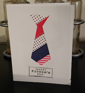
Happy Father's Day


The kids in Children's Church made this cute tie card for Dad's Day this morning.  Even the littlest ones were able to make this, and the older ones really enjoyed making the card.  I saw the little ones making sure their cards were safely tucked in pockets to share with Dad when they got home (OK, maybe they were folded into their pockets, but it's the thought that counts!)  And hey, what are a few stamping smudges anyway?!

I had been looking at YouTube a lot lately for washi tape ideas, and one of the ideas was to use a cut-out to show off or display the underlying washi tape.  So I cut a tie shape from the center of a 4" x 5 1/4" piece of cardstock with my Cricut Explore, one for each card we would make.  We then folded an A2 card and layered stripes of washi tape diagonally onto the card front.  The over-laying tie-shaped cut-out hides all but the tie shape opening, and voila, we have a striped Dad's tie!  In other words, we are using the Cricut Explore to cut out a "punched" shape, but no annoying hard-to-work punches.

Some of the kids further decorated the cards with markers and messages of love.  I suggested they decorate the inside of the card with a hand drawn heart.

This craft idea tied in nicely with last week's lesson on love as the first fruit of the spirit.

Thanks for looking, and I hope you are having fun with washi tape as well!  Happy Dad's Day!

Saturday, June 10, 2017

Konnichiwa!


Hello, everyone!  I am sharing a little card today I made from some new dies and some older stamps.  I needed to order from the Frantic Stamper (they seemed to be the only ones that had the stamp I wanted, not pictured here) and I saw their cute little Japanese girl die.  I love this die!  Here is the link:
  http://www.franticstamper.com/Frantic-Stamper-Precision-Die--Kokeshi-Japanese-Paper-Doll_p_139240.html

It's part of a release called "Visions of the East".  So cute!  And let me tell you more--Even though it is a thin metal die, you don't actually have to cut it apart to use it.  It is tiny, so you are not wasting much paper by cutting the whole die each time you need a section.  I really hate cutting off and filing all the poky metal parts on thin steel dies that are on the market.  I would rather pay more and have each part pre-cut, smooth, and ready to go.

For these cards, I cut the girls from white cardstock, black cardstock for their hair, and washi paper I have collected over the years.  The washi was a little more difficult to cut because it is fibrous--I had to use a shim to ensure clean cuts.  Oh, I used my Vagabond to cut these pieces.  After all pieces are cut, it is fun to mix and match hair and dress colors.  (Remember playing Color-Forms when you were little?!)

I placed the girls onto my new weaving die cuts, the one from Inky Antics (see my blog post about my graduation card, below).  For the card on the left, I used quilling papers to do the weaves, but I only had 1/8" thick quilling papers, so this was a lot of weaving!  For the card on the right, I cut 1/4" strips from pastel papers to do the weaving.  Much less stressful, and easier on my hands!

The parasol stamp was one from an older Hero Arts clear stamp set (no longer on the market) which I colored with Copic markers, and the sentiment I picked up at Hobby Lobby on sale some time ago.

Very much fun using these dies!  I think they could make cards for any occasions.


Wednesday, June 7, 2017

Looking 'round -- Are you here?


Here's lookin' at you kid!  I made the center card, pictured above, some time ago to use as a "missing you where have you been" card to send to my Children's Church kids that don't show up for a while.  I needed some more of these cards, not in pink (for boys) but I liked the design so I re-did in shades of orange and added an owl motif.  And I decided to augment the circle designs for each card with dimension.  I used a lot of circular "gem" rhinestones I had about and then went with my Ranger enamel accents for extra dimension.  I think the kids will really like these.  (Hopefully they won't in theory get one of these cards!)

The sunglasses images are cut from cardstock with my Cricut Explore.  The sunglasses image is available with the Cricut Access subscription (so handy--I never buy so-called cartridges).  The owl images and circles are cut with punches from scrapbook papers.  Such a fun design!  Oh, and I used metallic paper for the sunglasses lenses.

Thanks for looking!  When did you last play with your circle punches?  (I know you have them!)

Friday, June 2, 2017

Cookbookin'!

For this past Tuesday's art project, my group made 2 8" x 8" layouts for recipes.  And one of the recipes was mine--the cheese quiche, which the group had eaten at my house a couple of weeks ago.  Yummy!

Here is a pic of the layouts, designed by Carolyn:


So much fun!  And thanks, Carolyn, for these layouts and for keeping us organized!

Wednesday, May 31, 2017

Cozy Kitten Cards!


I saw a video online about these cute felt cat cards and really fell in love with them!   I have made several, and the ones you see above I think are the best.  I knew I bought that felt for a reason!  You never know what you are going to need!

I had been recently looking at the greeting cards at Target, and saw how so many of them use different sorts of embellishments, like felt for instance.  At the cost of these "designer" cards, I feel I have justified my die purchase in making just 4 or 5 of these cards.

And they would make great childrens' projects--after I cut the material with the dies that is.  I do not recommend these dies for use by children, but they would certainly have fun with the cut shapes.

This is the "Cat / Dog" die from Paper Smooches.  It can make a cat, a dog, a fox, an owl, a pig, and I am assured many other animals as well.  The dog one I made turned out OK, but not as cute as the cats.  Or maybe I am just partial to cats.

Here is a video to show how to use this die:   http://www.jennifermcguireink.com/2017/05/cardmaking-with-felt.html

And even better, I want to use my Cricut Explore to cut some felt shapes for my cards.  Here is a Lori Nunnemaker video that shows her process:

https://www.youtube.com/watch?v=uDsf13N2k4Y&t=335s
 
     She is making hairbows in the video, but you get the idea.  I have tried cutting felt in my Explore before, but not really successfully.  I have ordered the exact things she uses:  the green mat, the Heat and Bond Ultrahold, and I will give a report when my products arrive.  Cricut has so many cute shapes that would be spectacular cut with felt!

Saturday, May 27, 2017

Cards for Kids


I recently purchased from Inky Antics because I love the novelty look of their images and embellishments.  Plus, the stamp sets make great kids cards.  So, above, you are looking at one of the cards I made.  I used the seal and sea lion set to make this fun birthday card which is embellished by a scratch off sticker.  Hence the penny!  This stamp set is part of the Scratch Off stamp sets designed to go with the Scratch Off stickers.  Totally fun!  I colored the images with Copic markers and added a few fun papers, making about 6 or 7 of these cards so I will have birthday cards for the kids at Children's Church.  One has already debuted and it was a hit!  I added some glossy accents to the beach ball for a bit of texture.

Here is another fun card:


Again, colored with Copics and a few bright papers.  Below, the inside:


This card set features elephant images and a 3d feature using HoneyPop paper, another fun item from Inky Antics.  There are a whole series of the these stamp sets geared toward using the honeycomb paper.  Very fun!  A little bit of washi tape and an applauding mouse from the stamp set complete the card.

I find the kids like the stamp sets that use puns, riddles, or an interactive feature of some sort.  I hope they like these amazing cards!

Friday, May 26, 2017

Using New Distress Oxides


Everyone who knows me knows Tuesday is my crafting day!  I get together with friends and make all sorts of fun things.  This week we played with the new Tim Holtz Distress Oxide inks.  Yes, I know there are a million blog posts and videos showcasing this product, but now mine is added to the list.

We first focused on making backgrounds with the inks.  The tag to the left above is made with Bristol Board.  The tag to the right is a ready made manila tag (I may have used a white one.)  We smooshed the inks onto the craft mat, added water, then dragged our tags/papers through.  Heat set, then again in the ink.  Lovely results!  I can't tell you what colors I used because I don't remember, but you can probably guess from the colors in the picture because there are only 12 colors of these inks.

When the ink was dry, I used flourish stamps to overstamp in white pigment ink and then heat emboss with white powder.  Additional stamping, then added a cut out faux postage stamp (Hero Arts) that I colored with various media.

The secondary flourish on the card, to the right of the tag, is a Tim Holtz flourish die that I cut in white card then added the Nuvo embellishment mousse in turquise.  The cards are matted with scrap papers or previous stampings I had done.  Trying to use up stash!  Here's a pic of additional cards:


I have to say I am at the moment loving these Distress Oxide inks.  Lovely, lovely backgrounds.

Thursday, May 25, 2017

Happy Graduation!


Sorry for the blurry picture--I must have been in a hurry to upload.  I have been busy, busy cardmaking and can't wait to share all my creations!

I needed three graduation cards, so here is what I came up with.  I used my new paper weaving die I got recently from Inky Antics.  Such a fun die, but I had thumb problems--pain and swelling--from making so many paper woven cards!  I will have to pace myself with these!

I had gotten a fabulous little 6" paper pad from Jo Ann's on sale--full of colorful solids that I thought would be good to have on hand for my Cricut cutting.  They were so colorful, and did I say glitzy?!  I set the colorful strips off with a black background for this card.

When I first got the paper weaving die, the directions indicated to use quilling strips for the woven strips.  So I did!  But I didn't realize until I already made two (so much weaving!) that the directions called for 1/4" quilling strips.  I had been using 1/8" strips.  Duh!  So when I made this card I hand cut my strips to 1/4".  I did find that the weaving goes so much better if you actually use a scant 1/4" or just a little less than 1/4" wide.

I think the colorful strips set off with a black background were the perfect backdrop for the little graduation figure (Stampington) which I have had for years and haven't used for years.  I used a regulation blue for the graduation robe, but if you were thoughtful and not in a hurry (like me) you could customize the robe to the school colors.

So, three graduation cards finally finished and ready for the mail.  Check that job off!  Thank you, papercrafting supplies!

Saturday, May 13, 2017

Happy Mother's Day!


This is the card we are going to make in Children's Church tomorrow.  I got the design from Lia Griffith.  I love her projects, and she has easy downloads if you belong to her site.  Check it out: liagriffith.com

No affiliation, I am just a fan.

This is a cute cactus design that you punch holes in and then stitch with embroidery floss.  The inside of the card says  "Thanks for helping me grow."  I love it that these are so cute and fast and easy.

Thanks, Lia Griffith, for helping me have a happy mother's day!

Monday, May 8, 2017

Encouragement Card


I made this card as an encouragement card for the college students at our church as graduation and finals approach.  Inside it says, "It's the journey, not the destination that counts.  Go with God, wherever He may lead you, and you will do all right."

I used the Cricut Explore program to create the arrows on the front of the card, importing a simple arrow image and changing the colors of the arrows and varying placement of each.  Then I "print and cut" each card front.  I stamped the sentiment onto vellum and made a vellum band around each of the card fronts before placing the fronts onto the prepared cards.  I had printed the card insides with Word.  The final touch was the little arrow sticker embellishment, which is not only attractive, but also helps hold the vellum band in place.

I have to say, the sentiment stamp (My Sentiments Exactly) was my inspiration for this card.  I got it at Hobby Lobby and knew it would be the perfect message for an inspiration card for students.  I think the vellum, which I also got at Hobby Lobby, stamped beautifully.  I made 22 of these!  Lots of work for my little bug!  and my printer!  and me!  I know the card won't be as appreciated as the gift card that goes inside, but at least the kids know we are thinking about them.

Wednesday, April 26, 2017

Playing with Chibitronics Light Up Cards!


What you are seeing in the picture is my first light up card!  I used the kit from Chibtronics to make the light up circuit.  So much fun!

I again got the idea from Big Picture Classes, this time from a class called Interactive Cards for Kids.  The card above lights up beautifully (the eyes of the mask on the left light up when you press the flower on the right).  But, and this is a big but--you have to use three layers of thick foam adhesive tape to keep the battery in place.  (The battery is below the red flower on the right.)  This is way thicker than any shaker card I have ever made.  More about that later.

Anyway, I made the card front in its entirety first.  I embossed a piece of aqua cardstock with a tropical embossing folder and then rubbed one of my new loves over the top of it--Nuvo Embellishment Paste, in copper.  I then stamped, colored, and cut the images from My Favorite Things Tiki Party stamp set and arranged them on the card.  I then poked holes in the eyes I wanted to light up and followed the directions given on the Big Picture class site.  Very successful, but like I said, a thick card.

So-o-o-o, I went to work fixing this problem.  Here is my next card, with my "fix" included:


This time, after making the card front in its entirety, I punched a 1 3/8" square hole in the bottom right of the finished card front.  When I made my circuit, the only adjustment I made was to make sure the folded card stock that holds the battery is no bigger than 1" square.  I then made a layered adhesive "box" around the 1" folded card, added a 1 3/8" square with a 1" square cut out in the middle out of matching brown cardstock and affixed that to the top of the layered foam adhesive.  I added only a single layer of foam adhesive to the rest of the card front and slipped the card front over the "box", centering it on my folded 110 lb cardstock notecard.  (You really have to use the heavier cardstock as a card base.)  Finally I added a bouquet of flowers over the "box" to hide the battery button assemblage.  This way, only the battery assemblage is thick.  It makes a much nicer presentation

Anyway, if you want to learn more about how I made this fun light up card, head over to Big Picture classes.  I can't quit pressing the flowers to light up the eyes!  Very fun!  I will, however, give this card only to older children since it does contain a lithium button battery.

Monday, April 24, 2017

Cute animal silhouettes!


Aren't these animal cards adorable?  I had so much fun making them!  I saw the idea for them on another website (Jennifer Maguire), but she used a swipe technique.  I had no luck with that, so I just used colorful inks and then added more color with color pencil where needed.  Such a cute party birthday card!  And I used bits of Ranger stickles glitter glue on the hats and balloons.  It's a party in a card!  Love this Hero Arts stamp set!  I may get the matching dies--I can see a whole box of "animal crackers" stickers!

Thursday, April 6, 2017

Cake, anyone?


I saw Jennifer Maguire's post recently on monochromatic stamping, in which she made a cake card, and was intrigued with the idea.  I always need birthday cards, so I found this cake stamp by Hero Arts for half price at Joann's and went for it.  I think it fit the bill!

Here is Jennifer's original post:   http://www.jennifermcguireink.com/2017/03/mono.html

I have used all of the inking products she mentioned in her post previously, but never came up with such a WOW idea!

Instead of just framing the images, though, as she did in the post, I decided to turn my images into shaker cards.  One for a guy, one for a gal!   It's a party!  Love, love this technique!

Monday, April 3, 2017

Peacock Proud!


I had so much fun with my Hero Arts Peacock Layering Stamp set, as you can see in the picture above.  I made tons of peacocks with various inks and then had fun laying them out into cards.  On some of the cards I incorporated some stenciling done with embossing paste and then colored with inks.  Such fun!  The peacock is my emblem, as many of you know.  I have collected many peacock stamps in my lifetime, but I think this layering one is the most fun.  I also bought the matching die, but I found I really didn't need it, plus it is difficult to stamp in just the right position to use the die, plus you have to add his feet.  I just stamped and then cut by hand--not really such a big job.  Love this stamp set!

Friday, March 31, 2017

Tea Anyone?


This is my take on a card I saw on the Rubber Stamp Tapestry tutorial and idea page.  I used several of the tea peg stamps to compose sheets of stamped images and then cut those to 1.5" with a punch.  I wanted to align the images properly so I made a guide frame for placement using my Cricut Explore.  Very helpful!  I used this card as a get well card, inserting a tea bag into a vellum pocket I made for the inside of the card.  Also, I hope to have a tea party again one of these days and this card will make a perfect invitation.  Thank you, Rubber Stamp Tapestry!  I love my peg stamps!  Oh, did I mention?  Purple is my favorite color!

Saturday, March 25, 2017

Cardmaking Remix!

Well, I don't know about a "remix"  but I did spend some time making some cards that are repeats from some years ago.    Here's a pic:

 Both cards are made from older, retired Hero Arts shadow stamps, and both are ideas I got from Hero Arts.  I love my stamps, new or old!  I stamped the birthday card in a blue Clearsnap chalk ink three times and then punched, cut, and layered to get the look.  And to think I almost sold that tag punch is a garage sale!  The paper is from an older Hero Arts/Basic Grey 6" x 6" paper stack.  The card on the right was made from basic cardstock and stamping.  I stamped the dots background in a Ranger orange dye ink and the orange stripe was stamped with Clearsnap orange pigment ink.  The little flower and the hello sentiment was stamped over the orange with a Black Memento dye pad.  A little bit of ribbon and I have some cute cards!  Thank you, Hero Arts, for your timeless images!  I hope to still get some mileage out of them!

Tuesday, March 21, 2017

Elmo's Birthday Pop Up Card


I needed a birthday card for a 2 year old.  Really?!!! What does a 2 year old want a card for, unless to eat it?  But I needed it, so I found this cute little file on Cricut Make It Now.  It is a design from a cartridge called "Sesame Street--Elmo's Party".

I just love Cricut Design Space!  I paid for just the images I need, rather than buy an entire cartridge I absolutely didn't need.  Don't you find that a lot of the images within a cartridge are really just repeated images?  So I purchased just the pieces I needed for this card, and thank you to whoever designed the card so I didn't have to!

But I did have to figure out how to put the pop up inside Elmo together, and that was a struggle.  No Thank You please to Cricut, who does not have an illustration or how-to guide for this.  After ruining two Elmos I thought I had it figured out, but as I looked over the meager directions in the Make It Now section, I realized I was missing something.  I googled "Elmo pop up Cricut card" and found a wonderful video of a lady making the Elmo Pop Up.  Here is her link, in case you want to make a Pop Up Elmo, too:   https://www.youtube.com/watch?v=EErZBqyvr7c&list=PLV4sFhcxLIHLf9ORS9T1NYaYdGq5kWFvo&index=64

And here is my Elmo Pop Up:


Love it!  So bright and cheery for a little one, and maybe even a 2 year old will like the card, besides the taste of it!

Saturday, March 18, 2017

Flowers made with heart!


I had so much fun this morning creating these cards!  And what a clever technique!  I had signed up for a class by Lisa Spangler on Big Picture Classes.  https://www.bigpictureclasses.com/  Lisa shows how you can make big flowers from small heart stamps!  I love this idea!  And to think I have already invested in so many large flower stamps that now hurt my hands to press!  I think these cards came out pretty well, despite the fact that they were my first attempts at this technique!  and they look like the flowers I made from Hero Arts large flower stamps that I pictured on the heading of my blog!

I used some older Hero Arts stamps to make these cards.  I have no idea what stamps I used because I have unmounted all my wood stamps and have them on cling mount.  The two cards at the left were stamped with the same bold heart stamp.  The only difference between them is the spacing.  I used a 1 1/8" circle to space out the larger flower, and I used a 1" circle to space the smaller flower.  I used Clearsnap Orchid Pastel chalk ink for both.  The smaller flower is actually stamped on the card front.  The larger flower I cut out and attached to a card front.  The accent papers were from Confetti Birthday pad from DCWV.  The stamped circle sentiment is from Paper Smooches Spiritual Sentiments stamp set.  Inside the card says,  "on your birthday and always" that I printed on the computer.

The card at the right used the hearts in an overlapping manner.  I stamped using a Clearsnap pink pigment pad and then cut out and colored the flower with water based markers.  The center of this flower is actually a fussy cut flower from another printed paper, from Magenta.   I  think the vintage papers I chose for the background (Hobby Lobby) complement the vintage colors I chose for the flower.

I had one teeny problem making these cards.  You see, I ran out of tape runner.  And I am loathe to buy more.  It is so expensive!  So I used a lot of glue to put these cards together, and I have to practice!  I got glue everywhere!  I am thankful for my Tombow Mono sand eraser that helped with erasing some of the most obvious glops.

Thank you, Lisa and Big Picture Classes for a fun technique!  I will have fun making some more cards!

Sunday, March 5, 2017

Copy cat card


I saw a card recently on the Rubber Stamp Tapestry tutorial page that I just had to make!  I think I copied it almost exactly!  Here is the original project:  

http://ideas.pegstamps.com/2007/01/01/wild-berry-vine-in-blue-card/

What do you think?  I even had the cute little Stampin' Up pink and blue flowers for the embellishment!   Of course I am sure I used different stamps (don't even ask me what they were because my peg stamps are like all mixed together right now!  That means they are busy and in use, and that's a good thing!  Oh, I used my Cricut Explore to write and cut the greeting on my card, as well as cut the papers to the size needed.  I find my Explore really helpful in this respect, since I can use the finished card size as a template and then just load the pieces onto the template to get the right size for each piece.  No measuring!  I did use a scalloped punch for the pink scallop, however.

Sometimes, especially lately, when I seem to be in an artistic no man's land and can't come up with my own designs to save my life, I love to go through the blogs and look and see what other people have done and copy their ideas.  They say imitation is the sincerest form of flattery!  I think if people are so possessive of their ideas that they don't want them copied they shouldn't post them online anyway.  That's my take, anyway!  And I always learn something from copying someone else's ideas, in addition to coming up with a finished card I can share with the world.  I made four or five of these cards and will send them to shut-ins and others who will really enjoy them.

Friday, March 3, 2017

Colorful Birthdays!


Those of you with January and February birthdays will know I am a little behind in my birthday card making!  I may have caught up!  Take a look at these colorful creations!  They are made with the Richard Garay 3D embossing folders I saw on a blog post from Laura Bassen for Simon Says Stamp.  I was so taken with the images I had to search high and low for them, since they are a discontinued product from Spellbinder's.  This rosette embossing folder was part of set released by Spellbinder's some years ago as part of a birthday set of related images, including stamps and papers.  I also found the two other embossing folders in the set online and will post my creations made from them in future.  Here is a link to the Laura Bassen video that showcases how she colored these images.  Her video was my inspiration for these cards.

https://www.youtube.com/watch?v=GgiyVwvh5h4&index=57&list=PLV4sFhcxLIHLf9ORS9T1NYaYdGq5kWFvo

I used Distress Inks for most of the coloring, but also used Tombow and Copic markers for some of the brighter images.  I found that using a heavier weight paper really helped the images pop, and for these I actually used a glossy cover stock I have had for some time.  The glossy paper really holds the ink.

Aren't these fun!!  I am so excited about my new 3D embossing folders!  I also got a leaf one from Sizzix and some from American Crafts that have geometric designs.  I think they will all make beautiful cards.

Happy Birthday, in case I missed yours this year.  Have fun stamping!


Wednesday, March 1, 2017

Sympathy card


Due to a series of unfortunate circumstances, I somehow suddenly needed a lot of sympathy cards.  I guess as I get older I will run into this problem from time to time, so I need to be prepared.

It seems the stamping world, at least as I see it online, is pretty much populated by a young clientele, who favor the cute and whimsical.  Cute and whimsical has never really been my style, probably due to my mature years, but even when I was much younger I preferred nature imagery and clever design to fairy tale and cartoon imagery.  This is especially true when choosing images for sympathy cards.

Luckily, I rarely get rid of my older stamp sets, tools, or materials.  So I found a dated Stampin' Up sympathy stamp set in my stash and set to work.

I first stamped the lilies in black ink on white, and then promptly discarded those as not really suitable.  I then used gold ink and gold embossing powder, some on vellum, some on white card, and was pleased with the result.

I tried various ways to color the lilies white, and was not happy with anything I tried as a coloring medium.  I then picked up the black and white images I had previously stamped and cut out just the lily portions and mounted them behind the gold embossed images on the vellum.  I had colored the leaves green on the backside of the vellum.  The white of the stamped paper really showed up and the black stamped lines were well hidden by the gold embossing.  Voila!  That was my solution.

But now another problem ensued--what should be the backing behind the vellum stamped piece?  A plain card front really did nothing to show up the embossing.  I tried various printed papers and finally found a pretty piece that was gold foiled, but the piece was blue.  Blue behind my green and white lilies?  Not really.  So I got out my dated backgound stamps and found one that was highly detailed.  Again, gold ink and gold embossing powder were my friends.

The results are pictured above.  Just the right amount of elegance and minimal fuss to make a vehicle for a heartfelt message of sympathy.